Designing interiors for commercial properties is a tricky business. The space must be efficient and cost-effective, but also create a unique and engaging experience.
To further compound the problem, expectations are constantly evolving, so businesses must regularly adapt their interiors to reflect current tastes of their consumers, visitors, and employees.
Fortunately, some modern trends are helping them stay nimble with their designs.
1. Deep Tones
Reflecting the inherent beauty of nature, deep cooling tones are the flavor of the year. Look to use charcoals and greys tinged with greens. Combine them with ivory, stone, and taupe for balance.
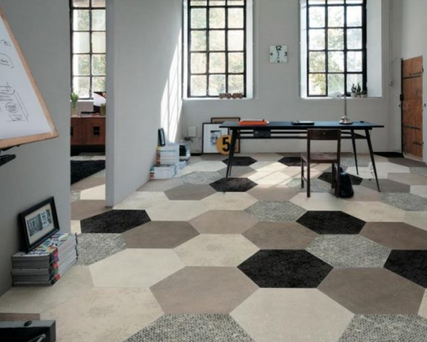
If this all seems a bit reserved, then add a few splashes of fiery paprika or zesty lime for color.
2. Super-scale and geometric patterns
Small-scale designs have long been expected from hotel or hospital flooring around the country. But expect to see them phased out over 2013 in favor of more dramatic, large-scale, geometric patterns.
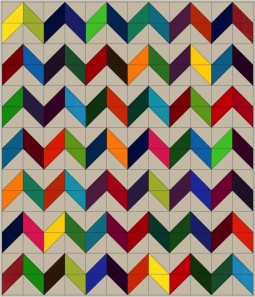
These striking designs help business create a true design statement that expresses personality and makes a lasting impression on visitors.
3. Form over function
It used to be that cost was the primary factor influencing decisions to purchase office furniture. However, with an ever-increasing focus on ergonomic design, the furniture in a modern workplace needs to be comfortable as well as cost-effective.
Expect to see more features like adjustable arms and head rests on office seating, as well as the emergence of standing height desks.
In addition, consumers are looking for quality — and commercial furniture is changing to reflect this by incorporating more durable materials like rustic woods, metal finishes, and tempered glass.
4. Quirky combinations
Interior designers today are moving away from obvious formulaic themes and instead including a variety of unexpected quirky touches to make each space unique.
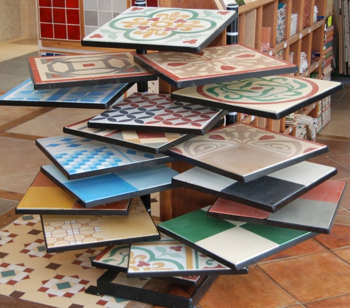
A pertinent example is the rise of non-matching floor tiles, which, though it may sound bizarre, can look great if applied in the right way.
5. Dual-purpose designs
A consequence of all this prolonged budget tightening means that business are constantly looking for new ways to save money. Commercial interiors offer a host of possibilities, as reflected in the growing popularity of multi-purpose designs.
Examples of this economic ingenuity can be seen in filing cabinets with slide-out seats that accommodate those spur-of-the-moment business meetings. Even lounge chairs have tablet arms, so employees don’t have to be at a desk to work.
6. Eco-builds
With corporations coming under increasing pressure to meet social obligations, there is a drive towards promoting eco-friendly commercial designs.
While glass use has generally been considered a mark of energy inefficiency, new advances in window design mean that this is no longer the case — glass looks set to become a staple of future eco-builds.
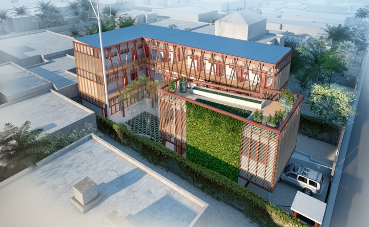
Consider installing photovoltaic glass, which has the next generation of solar cells incorporated directly into the window surface. This allows a once power-sapping design feature to begin generating its own energy.
7. Collaboration — not isolation
In an era of increasing interaction and constant communication, the modern worker is no longer willing to remain isolated in a tiny cubicle with no access to natural light. As a result, commercial spaces are moving toward a more collaborative approach, changing their interior design layout to create more open workspaces.
Desks are separated with low or transparent panels, or these partitions are removed altogether in favor of circular workstations that promote an increase in communication and knowledge transfer.
Of course, for most commercial properties it’s not possible or practical to conduct regular full-scale refurbishments. Instead, the emphasis is on making smaller changes — a shift in the furniture layout or a new coat of paint – that can make all the difference without breaking the bank.


[…] to look as good as possible. Today it is easy to combine practicality with aesthetics thanks to the interior trends of mixing textures and materials. In particular, Industrial vintage furniture is great if your […]
nice collection for understanding of commercial space
nice collection
Design in commercial premises can always be quite tricky! This article is really great! Thanks for sharing your collection.
Nature. The basic intuitive desire to be surrounded by what feels naturally pleasing to us is undeniable. Even in what we call geometric design forms, there are natural proportions that appeal to our inborn perceptions
The word trend is transient, superficient. “Current Variations” is my preferred term. It lends itself to the timeless essence of a design with a turn toward the world’s recent mind.
I like it when commercial building are eco-friendly. From the sound of it, it can be really beneficial to the company. Also, I find glass building more appealing.
Nice design these design helps me a lot in future . thanks for sharing this information keep guiding us
It’s very excellent information and more real facts to provided that post.Thank you for sharing this information.
Commercial buildings have gotten really cool in this modern age. I love the idea of the quirky additions to a room, to make the building unique. If I owned a commercial business, I’d want the exterior and the interior to stand out!
The company I work for has been looking into redoing the design of our building, and they wanted some tips. I agree that in a modern workplace the furniture needs to be comfortable and cost-effective. We wouldn’t want designs that were uncomfortable for us to work in. Thanks for the tips!
Nice Design. Thanks for sharing this informative information.
Nice Design. Thanks for sharing this information.
I liked that you pointed out that it would be smart to have a geometric pattern if you want to make an impact. It does seem like a good idea to have a professional help you come up with a design. That way, you can get the best look possible. I know that I wouldn’t be able to pick out a good pattern.
I think it’s always important to boost moral with a well-designed environment. I have noticed an increase in large, geometric patterns being used. They definitely stand out and are memorable. Thanks for the great photos to help illustrates some of the popular design trends!
We appreciate your comment. We’re glad you enjoyed!
Hi, Paul Blakeley
Thanks for sharing such an informative blog. Your all seven ideas of interior designing are really awesome. Each one has a different quality to make a commercial place more interesting. The Quirky combinations and Dual-purpose design ideas seem quite good. But the second last one Eco-build is amazing and it is also helpful in saving our environment just by implementing green interior design at the office. In the upcoming year, I am planning to a build new office in Perth and I am gonna definitely ask my all time favorite interior designer – Stiely Design to implement this idea at my place. Thanks again for a superb blog!!!!
Thank you for sharing this information. It was useful and interesting. I am looking to develop my shop with an interior designing and this could help me in ways.
The quirky organizing point reminds the pattern of Indo-western style at home.
I didn’t know that interior designers are moving away from obvious formulaic themes. I guess this makes sense considering people want things to be more abstract. I’ll have to consider your tips when doing some interior designing.
A very Unique blog to go with it! Really enjoyed reading your post.
This is excellent information.Hope you will share some more info.
Commercial Interior Designers in Bangalore
I really liked reading this article and the different options and combinations that can be used today in interior designs.
I like the way of mixing textures and materials so that the design becomes attractive for the client, where they are also used, furniture that has several functions, which helps in places with limited space.
nice blog. thanks for share information. we provides Best Interior Designers in delhi ,india.
Thanks for sharing very helpful for me keep sharing this type of content,
The part where your mentioned glass was interesting. Thanks for writing and sharing this awesome piece of content with the world.
Thanks for sharing such an interesting and informative blog. It helps me a lot.
Todays trends try to look for opened spaces and simple but efficient designs. I really lik what you say about opening up spaces and creating a colaborative space. It’s essential now a days. It’s amazing as well to see how new technological advances drive materials to evolve. Glass which was once frowned upon is now one of the main materials in sustainable buildings and efficient design. Great information! Thanks for sharing.
These are some great ideas! thanks for sharing
I like the way of mixing textures and materials so that the design becomes attractive for the client, where they are also used, furniture that has several functions, which helps in places with limited space.